
Predicting avocado prices using PROPHET
- #Projects

Overview:
I am forecasting avocado prices using Facebook’s Prophet model. Prophet is an open-source forecasting tool developed by Facebook’s Core Data Science team. It is designed to handle time series data with strong seasonal effects and multiple seasons of historical data. Prophet uses an additive model to fit non-linear trends and incorporates yearly, weekly, and daily seasonality, along with the ability to account for holiday effects. More information is here.
The dataset for this project is sourced from Kaggle: Avocado Prices. This dataset exclusively contains avocado prices sourced from various regions across the United States.
Problem Statement:
The dataset contains weekly retail scan data from 2018, capturing both the retail volume (units) and price of Hass avocados. Retail scan data is collected directly from retailers’ cash registers, reflecting actual sales. The Average Price represents the cost per avocado, regardless of whether they are sold individually or in bags.
Key details about the dataset:
- Date: The date of the observation
- AveragePrice: The average price of a single avocado
- Type: Conventional or organic
- Year: The year of the observation
- Region: The city or region of the observation
- Total Volume: Total number of avocados sold
- 4046: Total number of avocados with PLU 4046 sold
- 4225: Total number of avocados with PLU 4225 sold
- 4770: Total number of avocados with PLU 4770 sold
The dataset only includes Hass avocados; other varieties, such as greenskins, are not represented. PLU stands for Price Look-Up code, a system used by grocery stores and markets to identify produce items. Each code is a four- or five-digit number assigned to a specific type of fruit or vegetable, facilitating efficient checkout processes and inventory management. In this dataset, the PLU codes correspond to different types of avocados sold:
- PLU 4046: Represents a specific type of avocado known as the Hass avocado, typically sold individually.
- PLU 4225: Indicates the sale of organic Hass avocados, which are grown without synthetic pesticides or fertilizers.
- PLU 4770: Refers to the sale of large Hass avocados, often sold individually or in bulk.
By analyzing the sales data for these PLU codes, we can gain insights into consumer preferences and trends within the avocado market in the United States.
Let's start!
1. Import Libraries
First it is necessary to import essential libraries: pandas and 'numpy' for data manipulation, matplotlib and seaborn for visualizations, and Prophet for time series forecasting.
# import libraries
import pandas as pd
import numpy as np
import matplotlib.pyplot as plt
from prophet import Prophet
import seaborn as sns
2. Load the Data
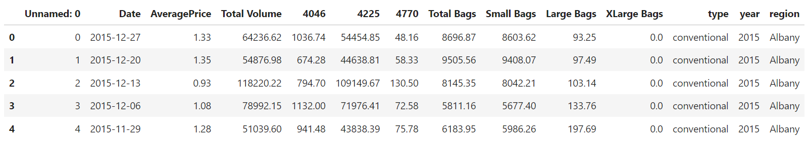
Let's load the avocado dataset into a DataFrame, which will contain historical data such as dates, prices, and volumes. The .head() function shows the first few rows for a quick look at the structure.
# dataframe creation for the dataset
avocado_df = pd.read_csv('avocado.csv')

# Let's have a look at the head of the training dataset
avocado_df.head()
Below is the dataframe:
3. Sort by Date
Time series data should always be in chronological order. Here, I sort the data by the 'Date' column to ensure that the subsequent analysis and forecasting happen correctly:
# Sort the DataFrame by the 'Date' column in ascending order to ensure chronological sequence
avocado_df = avocado_df.sort_values("Date")
4. Plot Historical Prices
Let's visualize the historical avocado prices over time to observe any visible trends or seasonal patterns. The plot should reveal price fluctuations over time, possibly indicating seasonal trends. Peaks and valleys might align with certain times of the year, reflecting demand changes.
import matplotlib.dates as mdates

# Convert 'Date' column to datetime
avocado_df['Date'] = pd.to_datetime(avocado_df['Date'])

plt.figure(figsize=(12,6))
plt.plot(avocado_df['Date'], avocado_df['AveragePrice'])

# Set the date format on the x-axis
plt.gca().xaxis.set_major_formatter(mdates.DateFormatter('%Y-%m-%d'))
plt.gca().xaxis.set_major_locator(mdates.MonthLocator(interval=1))


# Rotate and format the x-axis labels
plt.gcf().autofmt_xdate()

# Add labels and title
plt.xlabel('Date')
plt.ylabel('Average Price')
plt.title('Average Price of Avocados Over Time')

# Show the plot
plt.show()
Here is the plot:
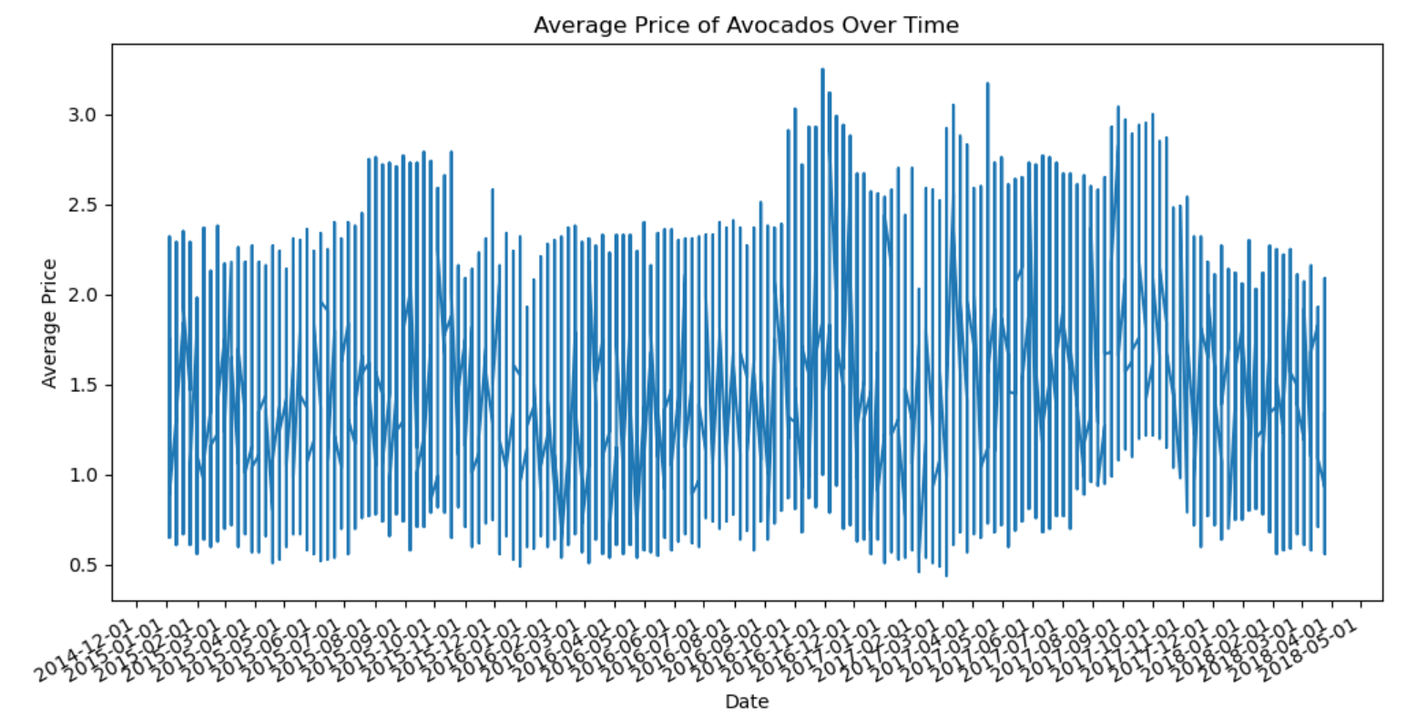
From 2015 to 2017, avocado prices peaked in mid-year (summer) and early fall, reflecting high consumer demand during these months. Prices consistently dropped in January, likely due to reduced demand post-holidays and increased supply from previous harvests.
Yearly variations suggest that while seasonal trends are prominent, other factors like supply disruptions and changes in demand also impact prices. The limited 2018 data makes it hard to draw firm conclusions, but tracking trends beyond May will provide a clearer picture.
Let's determine, if there's a relationship between the avocado prices and the quantity demanded.
price_demand_correlation = avocado_df['AveragePrice'].corr(avocado_df['Total Volume'])

print(f'Correlation between Price and Demand: {price_demand_correlation}')

# Scatter plot of price vs. demand
plt.figure(figsize=(10, 6))
plt.scatter(avocado_df['AveragePrice'], avocado_df['Total Volume'], alpha=0.5, color='blue')
plt.title('Price vs Demand (Total Volume) Correlation')
plt.xlabel('Average Price (USD)')
plt.ylabel('Total Volume (Demand)')
plt.show()
Here is output and plot:
Correlation between Price and Demand: -0.19275238715271914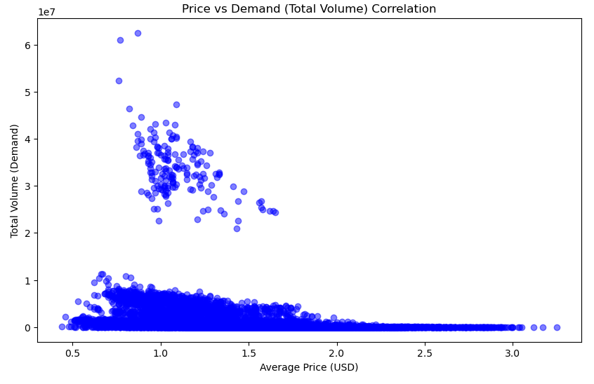
A correlation of -0.19 suggests a slight inverse relationship between price and demand, meaning that as prices increase, demand tends to decrease, but the relationship is not very strong.
In typical economic theory, higher prices tend to lower demand (and vice versa), but in our dataset, the impact of price on demand is minimal. This could mean:
Demand for avocados is relatively inelastic, meaning that changes in price do not significantly affect the quantity purchased. This could be due to factors like consumer preference or the availability of alternatives. There may be other factors influencing demand (such as seasonality, weather, or supply issues) that aren't captured in the price alone.
Let's plot demand curve and the price curve across different seasons.
# Ensure the dataset has 'Date' (or 'ds'), 'AveragePrice', and 'Total Volume'
avocado_df['Date'] = pd.to_datetime(avocado_df['Date'])  # Convert date to datetime
avocado_df['Month'] = avocado_df['Date'].dt.month

# Define seasons based on months
def get_season(month):
    if month in [3, 4, 5]:
        return 'Spring'
    elif month in [6, 7, 8]:
        return 'Summer'
    elif month in [9, 10, 11]:
        return 'Fall'
    else:
        return 'Winter'

avocado_df['Season'] = avocado_df['Month'].apply(get_season)

# Group by season and calculate the mean demand (Total Volume) and mean price (Average Price)
seasonal_demand = avocado_df.groupby('Season')['Total Volume'].mean().reindex(['Winter', 'Spring', 'Summer', 'Fall'])
seasonal_price = avocado_df.groupby('Season')['AveragePrice'].mean().reindex(['Winter', 'Spring', 'Summer', 'Fall'])

# Plot the seasonal demand curve
plt.figure(figsize=(10, 6))
plt.plot(seasonal_demand.index, seasonal_demand.values, marker='o', color='blue', label='Demand (Total Volume)')
plt.title('Seasonal Demand Curve for Avocados')
plt.xlabel('Season')
plt.ylabel('Total Volume (Demand)')
plt.grid(True)
plt.legend()
plt.show()

# Plot the seasonal price curve
plt.figure(figsize=(10, 6))
plt.plot(seasonal_price.index, seasonal_price.values, marker='o', color='green', label='Price (Average Price)')
plt.title('Seasonal Price Curve for Avocados')
plt.xlabel('Season')
plt.ylabel('Average Price (USD)')
plt.grid(True)
plt.legend()
plt.show()
The output is below:
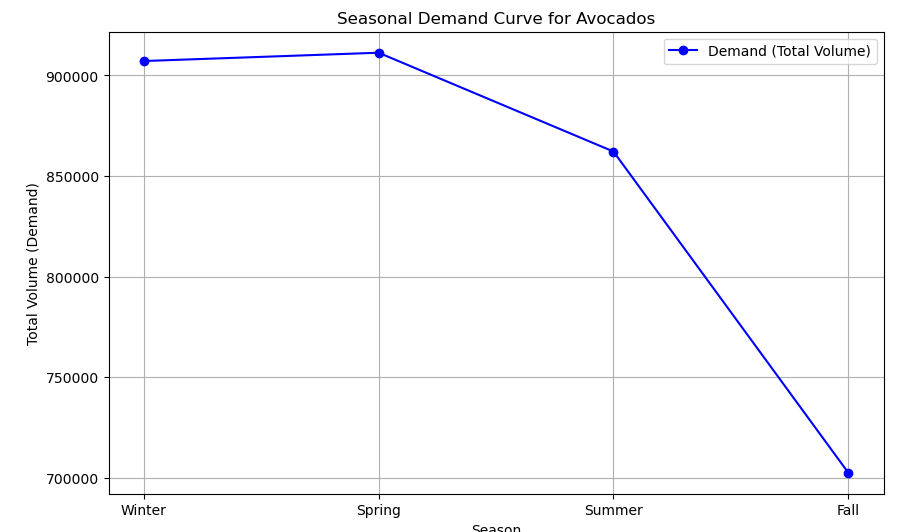
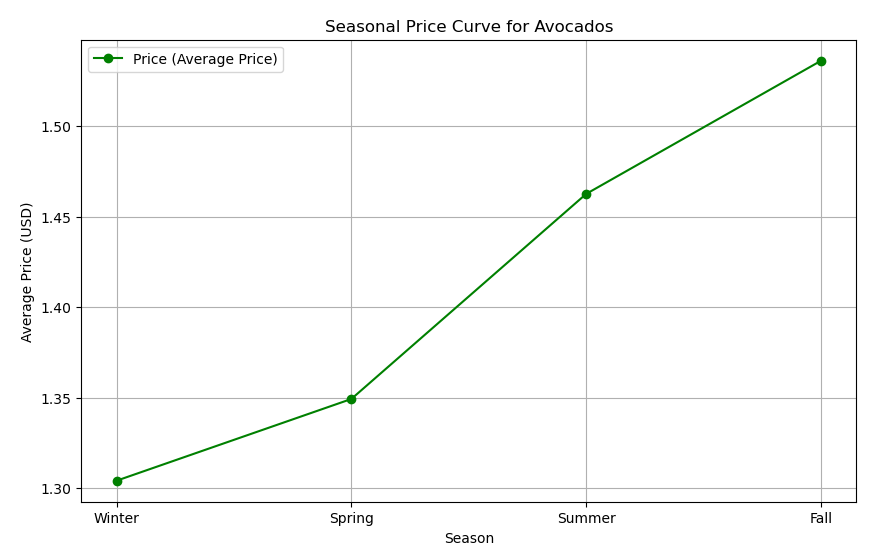
The seasonal analysis reveals stable avocado demand during Winter and Spring, with a notable decline in Summer and Fall, while prices consistently increase across all seasons. This suggests that, despite lower demand in the latter months, factors like supply constraints and consumer willingness to pay are driving prices upward. The dynamics indicate that consumers may prioritize avocado purchases based on preferences and availability, highlighting the complexity of the avocado market. Understanding these trends is essential for producers and retailers to adapt their strategies effectively.
Let's explore how avocado sales are distributed across different regions. Below is the code that excludes the 'TotalUS' region, calculates the total volume of avocados sold by region, and plots this data:
# Load your data
avocado_df = pd.read_csv('avocado.csv')

# Filter out 'TotalUS' region
filtered_df = avocado_df[avocado_df['region'] != 'TotalUS']

# Aggregate total volume by region
region_volume = filtered_df.groupby('region')['Total Volume'].sum().reset_index()

# Create the bar chart
plt.figure(figsize=[15,8])
sns.barplot(x='region', y='Total Volume', data=region_volume, order=region_volume.sort_values('Total Volume', ascending=False)['region'])

# Rotate x-axis labels for better readability
plt.xticks(rotation=45, ha='right')

# Add title and labels
plt.title('Total Avocado Volume by Region')
plt.xlabel('Region')
plt.ylabel('Total number of avocados sold (Billions)')

# Adjust layout to fit labels
plt.tight_layout()

# Save the plot to a PNG file
plt.savefig('avocado_volume_by_region.png', bbox_inches='tight')

# Show the plot
plt.show()
Here is how the plot looks:
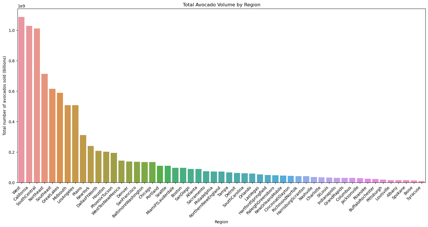
This bar chart visualizes the total volume of avocados sold across different regions. The regions represent a mix of individual cities, broader metropolitan areas, and larger state or multi-state regions. This setup allows for a visual comparison of avocado sales across distinct geographic categories. The West, California, and SouthCentral regions have the highest avocado sales, far surpassing other areas. This indicates that these large, avocado-producing and consuming regions drive a significant portion of overall avocado sales. Los Angeles, being part of California, also stands out as a major contributor, reflecting the high demand in the region. Major metropolitan areas such as New York, BaltimoreWashington, and PhoenixTucson also see significant sales volumes. These urban centers likely have high consumption rates due to their large populations and the popularity of avocados in modern diets.
The clear distinction between high-volume and low-volume areas helps pinpoint where avocado demand is strongest, while also providing insight into consumption patterns across diverse regions of the country.
It's also a good idea to compare sales across different years. Let's plot the volume of avocados sold by year:
# Aggregate the data by year and sum the total volume
year_volume = avocado_df.groupby('year')['Total Volume'].sum().reset_index()

# Create the bar chart for total volume by year
plt.figure(figsize=[10,5])
sns.barplot(x='year', y='Total Volume', data=year_volume)

# Rotate x-axis labels for better readability
plt.xticks(rotation=45)

# Add title and labels
plt.title('Total number of avocado sold by year')
plt.xlabel('Year')
plt.ylabel('Total number of avocado sold')

# Save the plot to a PNG file
plt.savefig('sales_per_year.png', dpi=300, bbox_inches='tight')

# Show the plot
plt.show()
And it is how the plot looks:
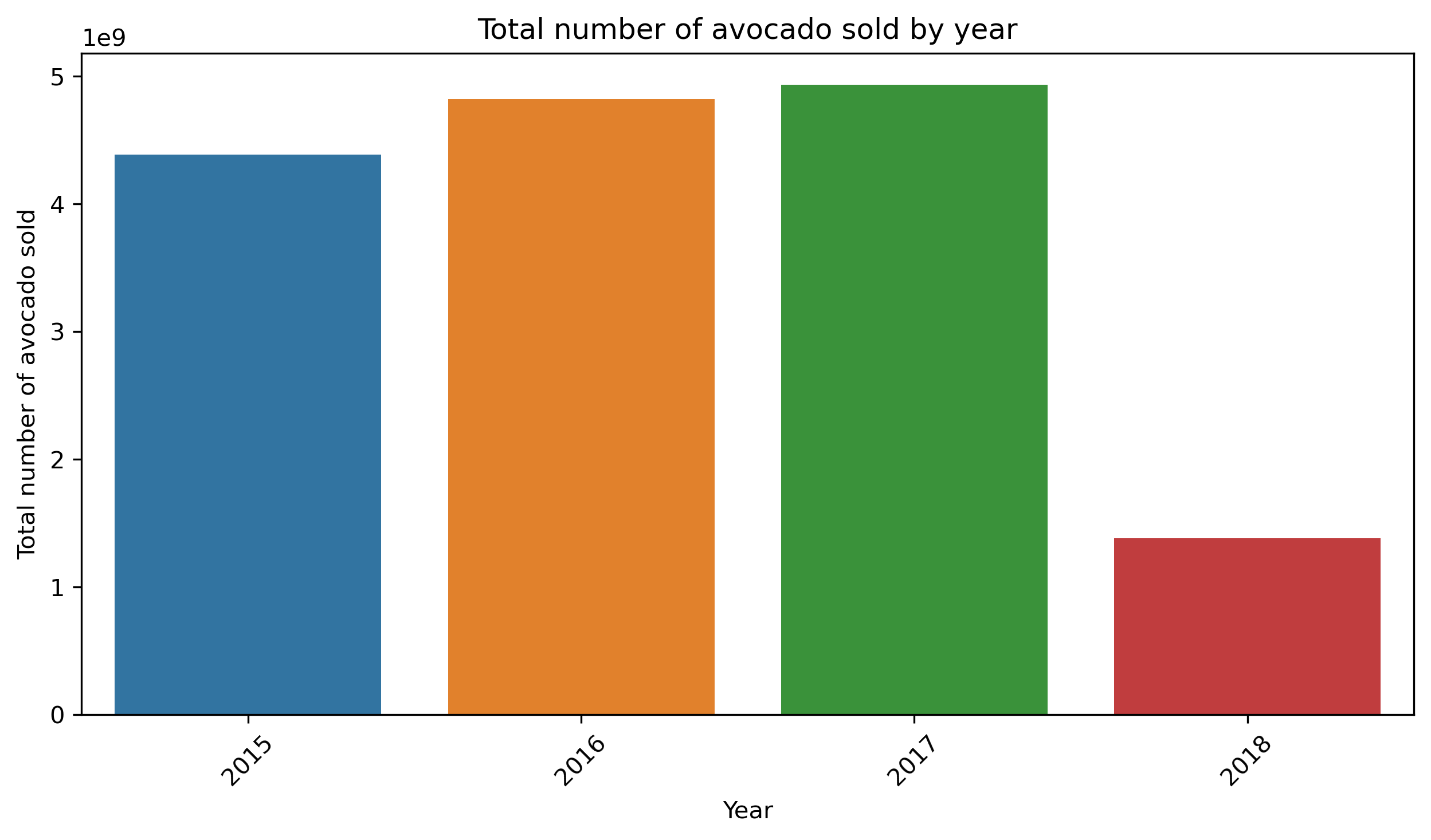
The distribution of avocado sales per year shows a steady increase from 2015 to 2017, indicating a consistent upward trend in avocado consumption. The data for 2018 is incomplete, so it's difficult to draw any solid conclusions for that year.
5. Prepare Data for Prophet
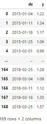
The next code creates a new DataFrame avocado_prophet_df containing only the Date and AveragePrice columns from the original data. This filtered dataset will be used as input for forecasting avocado prices using the Prophet model. Also I rename columns to 'y' and 'ds'. These specific column names are required by the Prophet model, where ds represents the date and y is the target variable to forecast
avocado_prophet_df = avocado_df[['Date', 'AveragePrice']]
avocado_prophet_df = avocado_prophet_df.rename(columns={'Date':'ds', 'AveragePrice':'y'})
# Remove duplicates based on the 'ds' column
avocado_prophet_df = avocado_prophet_df.drop_duplicates(subset='ds', keep='first')

# We need to be sure that data is sorted by date
avocado_prophet_df = avocado_prophet_df.sort_values(by='ds').reset_index(drop=True)
avocado_prophet_df
Below is the DataFrame:
Now we need to split dataset to train and test sets.
# Define cutoff date for training data
cutoff_date = '2017-01-01'

# Create training and testing datasets based on the cutoff date
train_data = avocado_prophet_df[avocado_prophet_df['ds'] < cutoff_date]
test_data = avocado_prophet_df[avocado_prophet_df['ds'] >= cutoff_date]
6. Initialize and Fit the Prophet Model
This step allows the Prophet model to learn the underlying trends and seasonality in avocado prices over time, which will later enable us to make accurate forecasts based on this historical data.
model = Prophet(yearly_seasonality=True, changepoint_prior_scale=0.05)
model.fit(train_data)
7. Forecast Future Prices
In the next steps, I will calculate the number of days in the test set, generate future dates based on that period starting from the end of the training data, and use the model to make predictions for these future dates.
# Calculate the number of days in the test set
test_period_days = (test_data['ds'].max() - train_data['ds'].max()).days

# Generate future dates for the test period
future = model.make_future_dataframe(periods=test_period_days, freq='D', include_history=False)
future = future[future['ds'] >= train_data['ds'].max()]  # Filter future to start from end of train data

forecast = model.predict(future)
Let's filter the forecast to only include dates up to the last date in the test data, convert the forecasted dates to the correct format, and then plot the forecast to visualize how the model's predictions align with the test period.
# Filter forecast to match only up to the last date in the test data
end_date = test_data['ds'].max()
forecast_filtered = forecast[forecast['ds'] <= end_date]

# Manually convert dates to numpy array format
forecast_filtered['ds'] = np.array(forecast_filtered['ds'])

# Plot forecast filtered by end date to match test data range
figure = model.plot(forecast_filtered, xlabel='Date', ylabel='Price')
plt.title('Avocado Price Forecasting Limited to Test Data Period')
plt.show()
Below is the plot:
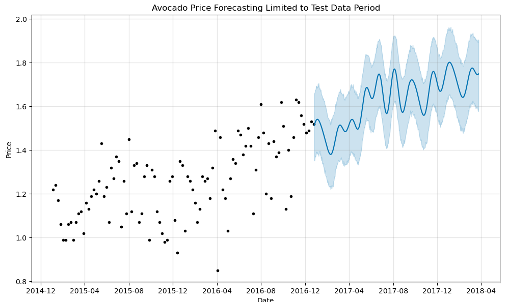
I would say that the model is capturing some of the seasonal trends but not perfectly aligning with the expected peaks.
8. Evaluation
In this step, I will calculate evaluation metrics to assess the accuracy of the model's predictions. Specifically, I will compute the Mean Absolute Error (MAE), Mean Squared Error (MSE), and Root Mean Squared Error (RMSE) to quantify the differences between the actual and predicted avocado prices.
from sklearn.metrics import mean_absolute_error, mean_squared_error

# Calculate Evaluation Metrics
mae = mean_absolute_error(forecasted['y'], forecasted['yhat'])
mse = mean_squared_error(forecasted['y'], forecasted['yhat'])
rmse = mse ** 0.5

print(f'Mean Absolute Error (MAE): {mae}')
print(f'Mean Squared Error (MSE): {mse}')
print(f'Root Mean Squared Error (RMSE): {rmse}')
Here is the output:
Mean Absolute Error (MAE): 0.19336396800883993
Mean Squared Error (MSE): 0.06546139387201826
Root Mean Squared Error (RMSE): 0.25585424341217844
The MAE and RMSE are relatively low, suggesting that the model's predictions are fairly close to actual values.
However, since RMSE is higher than MAE, it suggests that there are some larger prediction errors that skew the results.
Probably what could help: refining seasonality, changepoints, or adding more data to better capture patterns.
In summary, the model performs decently but could benefit from fine-tuning to better handle larger fluctuations in avocado prices.
In the next code, I ensure that all the ds columns (dates) in the training, testing, and forecasted data are explicitly converted to datetime format. This ensures consistency when plotting the results. Then, I create a plot to visualize the training data, test data, and predicted avocado prices, along with a shaded confidence interval around the predictions to represent the uncertainty.
# Ensure all 'ds' columns are of datetime type explicitly
train_data['ds'] = pd.to_datetime(train_data['ds'])
test_data['ds'] = pd.to_datetime(test_data['ds'])
forecasted['ds'] = pd.to_datetime(forecasted['ds'])

# Now plot again after ensuring datetime consistency
plt.figure(figsize=(14, 7))
plt.plot(train_data['ds'], train_data['y'], label='Train Data', color='blue')
plt.plot(test_data['ds'], test_data['y'], label='Test Data', color='orange')
plt.plot(forecasted['ds'], forecasted['yhat'], label='Predicted', color='green')
plt.fill_between(forecasted['ds'], forecasted['yhat_lower'], forecasted['yhat_upper'], color='gray', alpha=0.2)
plt.title('Avocado Price Forecasting with Prophet')
plt.xlabel('Date')
plt.ylabel('Price')
plt.legend()
plt.show()
In the next part of the code, I create a new plot, which separates the forecast into its main components: the overall trend, seasonal patterns, and any special effects such as holidays. By examining these components, we can better understand the factors influencing the avocado price predictions, including how trends and seasonal variations contribute to the forecasted values.
figure3 = model.plot_components(forecast_filtered)Here is the output:
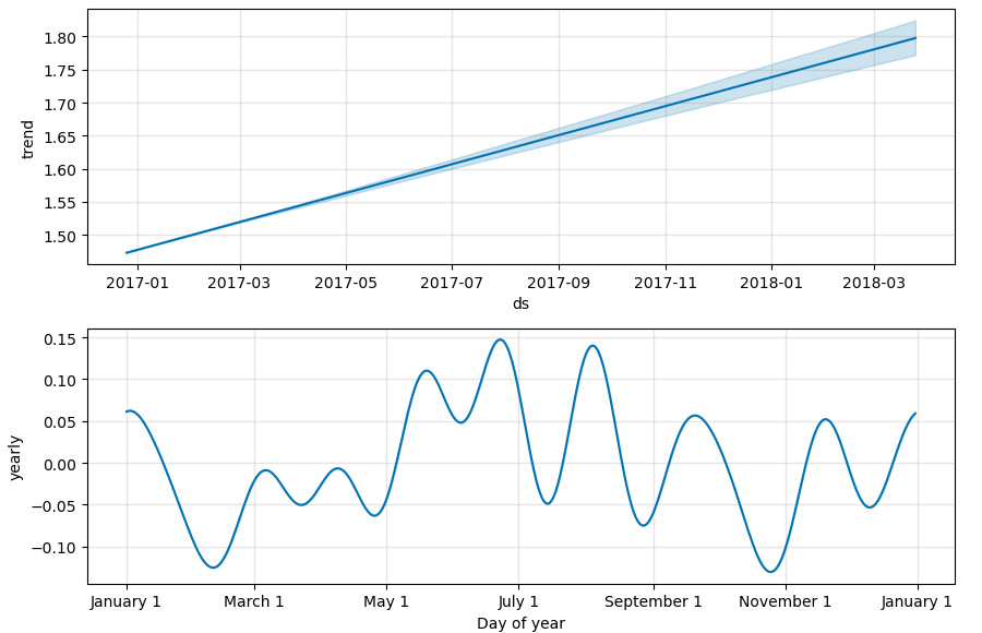
What do these plots show: Trend Component: This plot shows the overall direction of avocado prices over time. It highlights the long-term trends, indicating whether prices are generally increasing or decreasing.
Yearly Seasonality Component: This plot illustrates the recurring seasonal patterns within a year. It reveals how avocado prices tend to fluctuate at different times of the year, capturing annual trends such as peaks and troughs related to specific months or seasons.
The components plot reveals that avocado prices exhibit a clear upward trend over time, indicating a general increase in prices. Additionally, the yearly seasonality plot shows regular annual fluctuations, with specific months experiencing predictable peaks and troughs, highlighting the seasonal nature of avocado pricing.
Conclusion
This project provided an in-depth analysis of avocado pricing and demand trends from 2015 to 2018, utilizing various visualization techniques and statistical methods. Through the exploration of historical price data, we observed distinct seasonal patterns, with prices peaking during the summer and early fall, while demand remained stable in winter and spring but declined significantly in the latter part of the year. The correlation analysis revealed a slight inverse relationship between price and demand, indicating that while higher prices may lead to lower sales, the connection is not strong, suggesting that avocado demand is relatively inelastic due to consumer preferences.
Additionally, the regional analysis highlighted California and other key areas as major contributors to avocado sales, underscoring the importance of geographic factors in consumer behavior. The implementation of the Prophet model for forecasting prices was a first-time endeavor that demonstrated reasonable accuracy, although the model's predictions could benefit from further refinement to better capture seasonal fluctuations. This project ultimately emphasizes the complexity of the avocado market and the need for ongoing analysis to inform strategic decision-making.
For more details and to explore the code used in this project, please visit my GitHub repository here.